Reify.
Visual Identity . Editorial Design . Websdesign with Monono Studio
Photography Credits:
Francesca Renzi
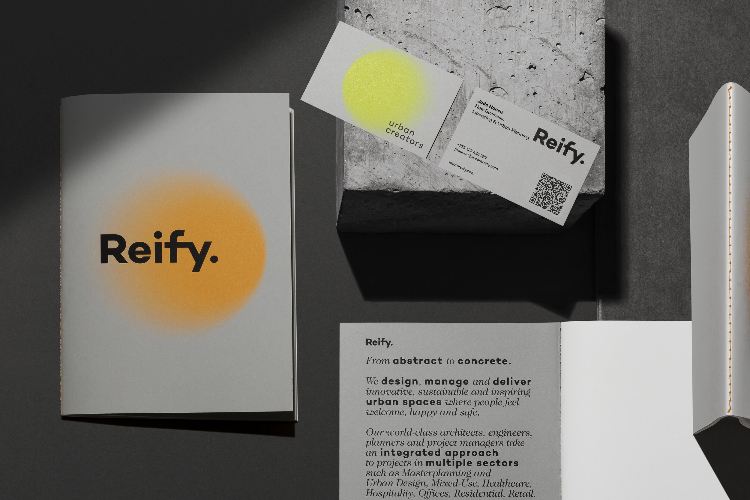
Reify. is an integrated player that provides a full spectrum of real estate services necessary to create, change, or boost projects, assets, and cities.
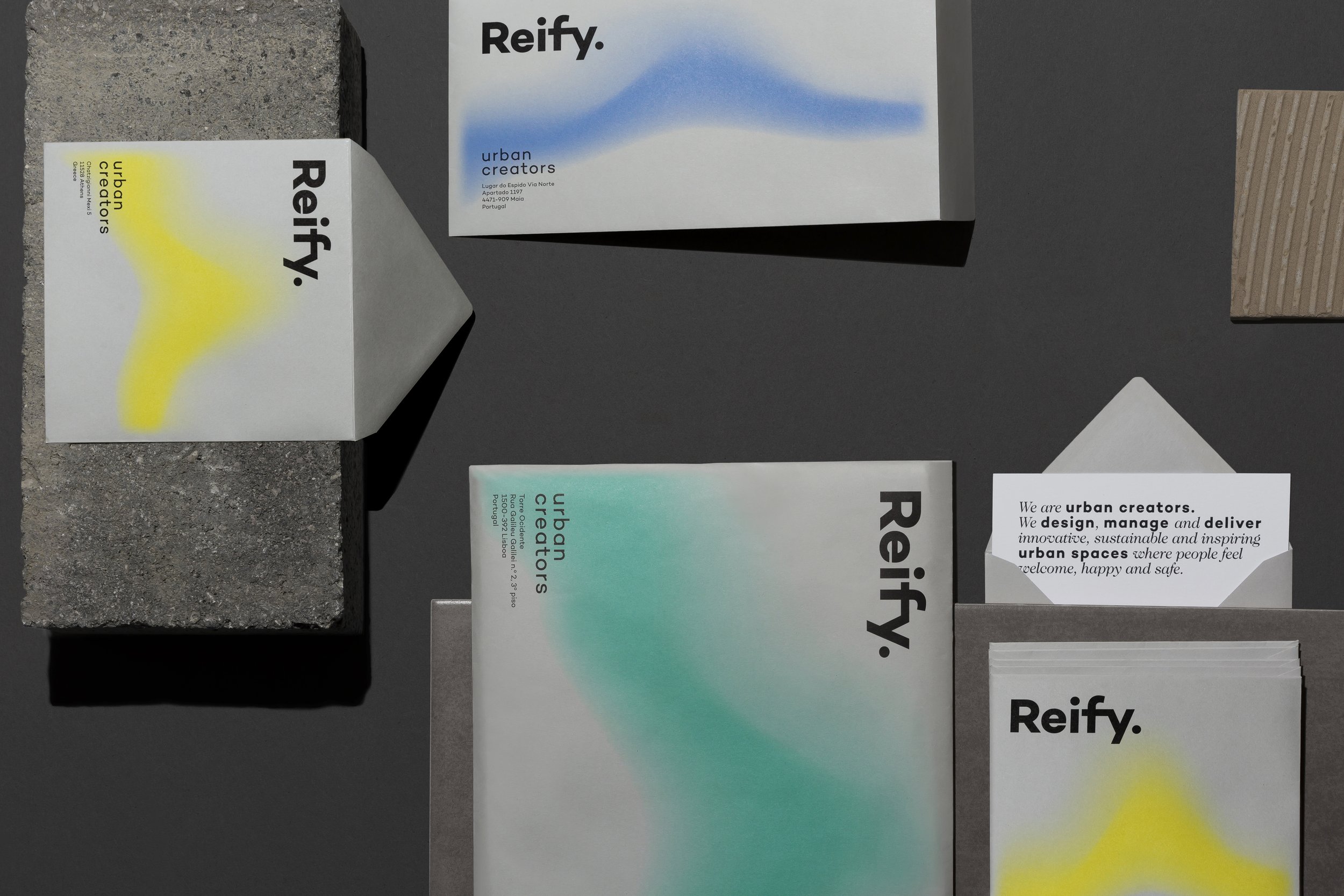
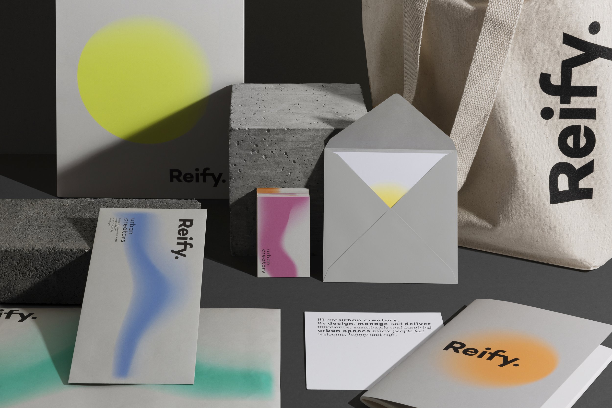
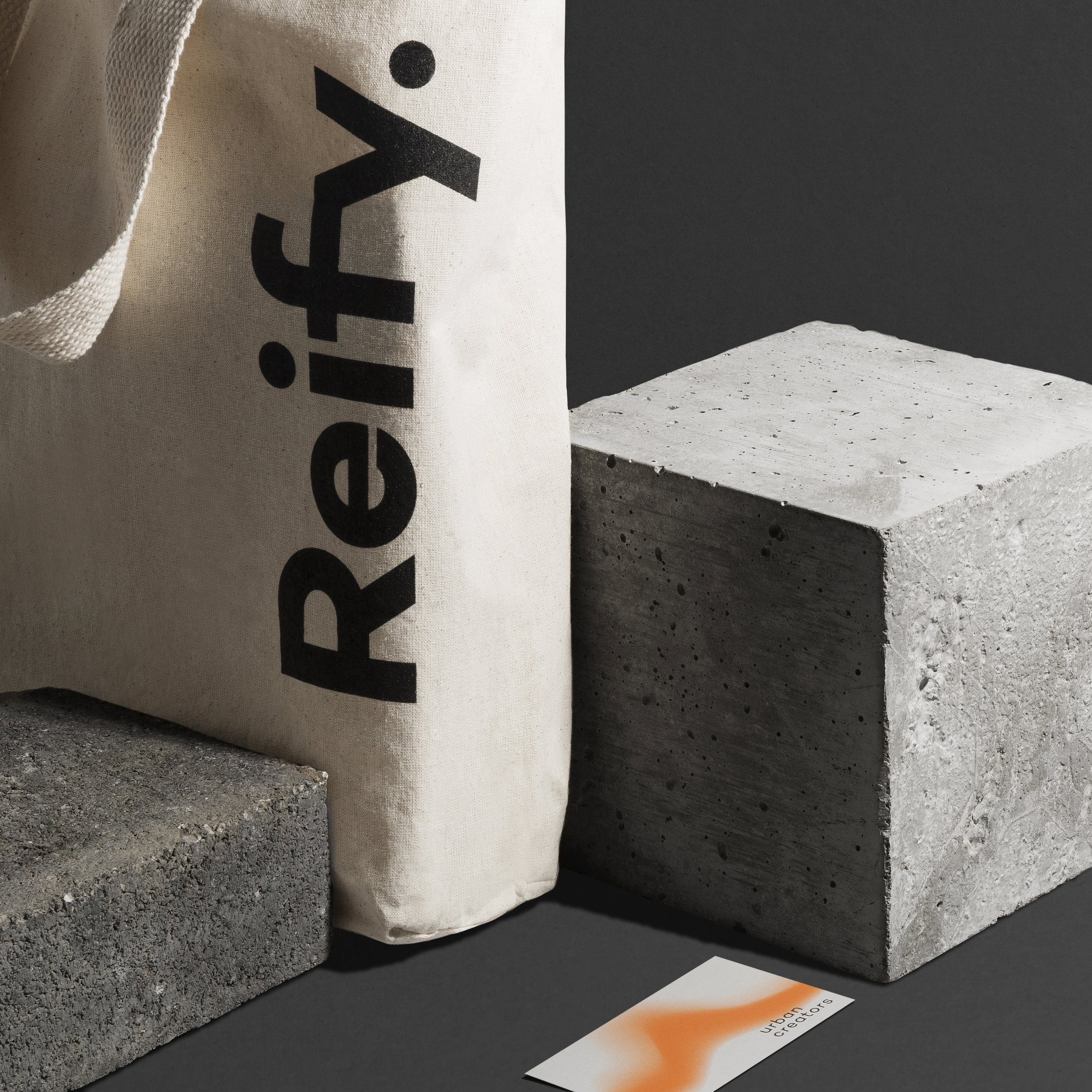
Reify is a word that reflects the evolution of something that is abstract into something real.
From real shape to abstraction, from abstraction to colour, from colour to shape.
The brand is based on graphic simplicity of type and colour, with a visual language of literal and implied intersections of gradients. A forward outlook colour establishes an immediate link between the graphic and the spacial. Changing forms represent a responsive, playful and universal graphic identity.